

“I’m on a sinking ship, and I can’t get off” – Stressy Sammy
The challenge.
Mental health at post-secondary institutions remain a progressively worsening crisis; however, the pandemic has further exposed and exacerbated these issues due to remote schooling and social isolation. In addition, recent findings indicate that a lack of confidence from students in the support offered by institutions to address these issue. Given the importance of mental health to academic performance and school credibility, we aimed to provide a potential solution that would help bridge the existing gap of mental health resourcing and student engagement in hopes of improving student health and academic success.
In partnership with the UofT Innovation Hub and using the IBM Activation Journey as a framework for this design discovery, we tackled this project in 2-week sprints with 4 sprints total. As a designer and a mentor, I primarily facilitated and coordinate the team’s design sprints and discussions to ensure thoughtful and provocative discussion, along with developing several design artifacts and documentation for user research.
The team.
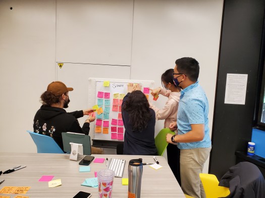
The team I participated was originally comprised of 5 members, both in-person and online due to COVID-19, but took on an additional 6th member due to circumstances with another team and us having the capacity. Team members came from many different disciplines and different countries/cultures, but synergized extremely well in a short period of time.

Isaac Tan

Xiaoping (Mary) Zhu

Mado Ghazal

Edith Krohmalnik
Ramya Mani Kumar

Yixin (Iris) Li
My involvement and highlights
My main roles on the team included:
- Leading and facilitating design discussions and meetings
- Mentoring fellow team members through design thinking and user experience practices and theory
- Developing protocols and methodology for primary user research and usability testing
- Conceptualizing use cases, personas, design goals and ideas based on primary and secondary research
- Designing low-fidelity and medium-fidelity prototype designs and screen flows/storyboards through Balsamiq and Figma
- Conducting primary user interviews and usability testing with real participants from representative user groups
- Presenting work-in-progress and prototypes to user experience experts from various industries
The Problem Space (User Research)
Our research began with primary and secondary research conducted through online interviews and surveys with representative University students. From the 10 participants interviewed, 22 survey responses and detailed secondary research, we gathered some key struggles which gave us a snapshot of the problem space, the problem’s severity, and what underlying factors might be at play.
- Access – students are busy with school and life stressors, limiting their capacity to actively seek out and use resources in a timely way.
- Compassion – university messaging about these resources is impersonal and uncompassionate.
- Information – students who seek out information often find it inaccessible, unavailable, and overwhelming.
- Trust – this delivery has created isolation and distrust in university resources, students struggling to find resources that effectively address their problems.
- Community – despite relying on them for information, students lack support and empathy from faculty and administration, turning to personal networks to fill this hole.
We knew that this topic was not only something that was pervasive and well-documented in recent years, but also directly affected other stakeholders such as the University’s faculty and support staff for mental health. As this resonated deeply with us, being current University students undergoing the same pressures, the team and I set out to create an empathetic and understandable persona and map out their journey.
The Current Situation (User Research Analysis)
Our analysis of the research brought us to the creation of several artifacts which ultimately lead to our Persona, Stressy Sammy, who would represent the users we interviewed and what kind of issues and challenges exist with them. The creation of a proto-persona, an empathy map, and an as-is scenario helped highlight what current struggles and pain points users go through.

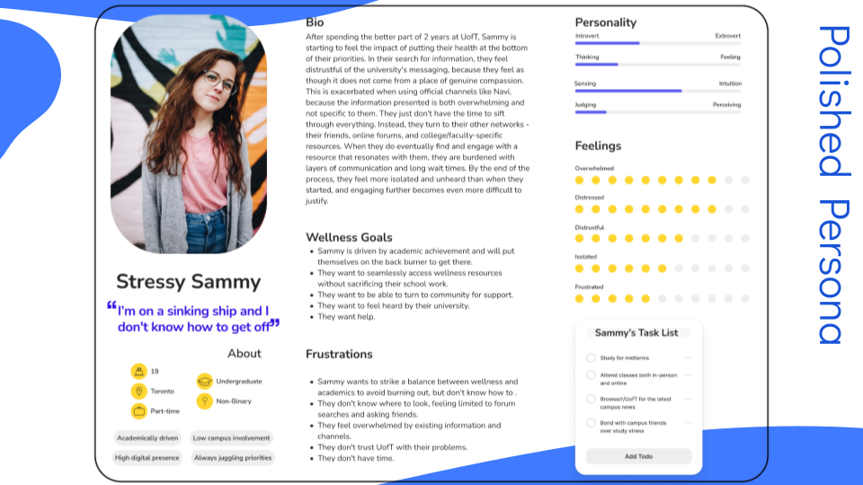


Through understanding the current struggles that our user(s) go through in their current lives, it helped humanize the problem and start to inspire our brainstorming for potential solutions. My biggest learning as we went through the creation of our persona was that with mapping out the existing scenario, we had to prioritize the major pain points through a voting system that helped me focus our story – if we had too much going on, we’d be stuck finding problems and not working towards a viable solution.
The Ideal Journey (Requirements Analysis)
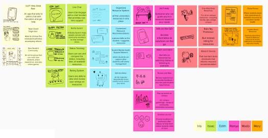
After learning about who our user was, we continued to distill these findings into targeted needs statements that would represent and drive our design ideas. These statements influenced our brainstorming and collaborating on potential ideas that could address each pain point and combine into a mental health resource for students. From generating ideas far and wide in as many ways as we could, then refining them based on a prioritization grid of feasibility and impact, we settled on what ideas were our key winners to implement into our solution and imagined a better, more ideal journey for our persona using these new ideas and solutions.


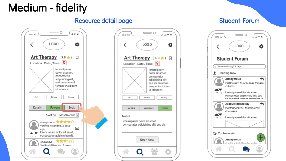
The Concepts (Low-Fidelity, Lean Evaluations and Medium-Fidelity Prototyping)
With our imagined journey and high-priority ideas as our focus to drive towards, we then targeted some design goals, also known as “Hills” in the Activation Journey, to create statements of clear intention and value. In a work environment, these would be crucial to any stakeholder involved in the development or success of the proposed product or solution. For our purposes, our project leaned towards an app-base which we developed with iOS standards and breakpoints in mind.


Once our low-fidelity sketching was complete, an informal and quick “lean” evaluation was conducted on representative users to gain preliminary insights into our design and whether or not we had any critical issues, confusing parts, or missing elements. We uncovered some fundamental issues with our imagined task flows including some confusion with labelling, usage of icons, and what the difference would be between search filters.
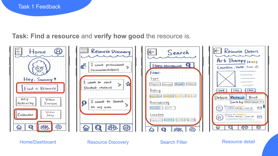
Ambiguity and flexibility were two key themes that we’d need to improve upon – having a lean evaluation allowed us to uncover issues with our icons, our use of language, and what implied functionality users would expect.
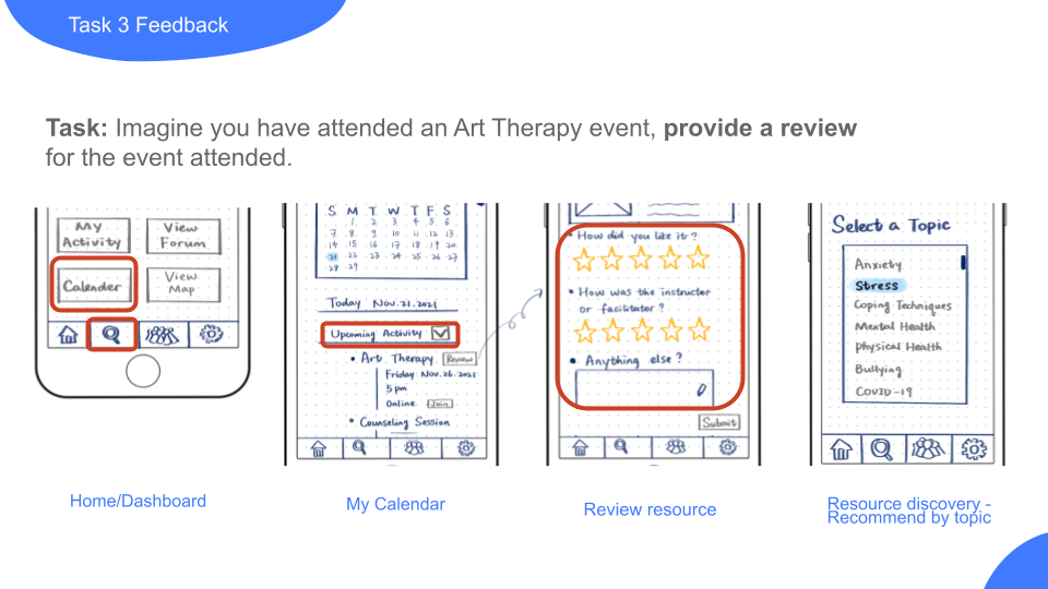
We also learned that “too much” in our design caused more issues than it solved. Scaling it back helped make things more understandable.
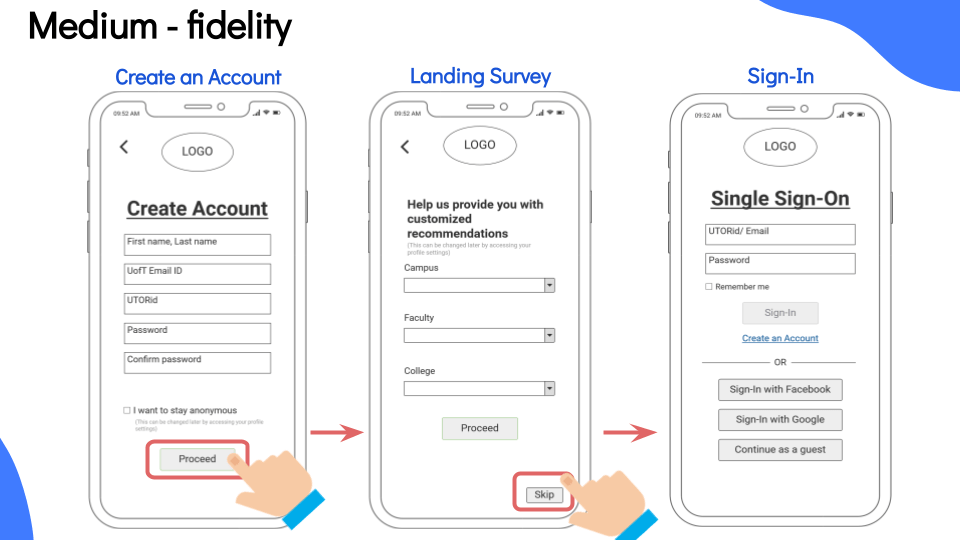
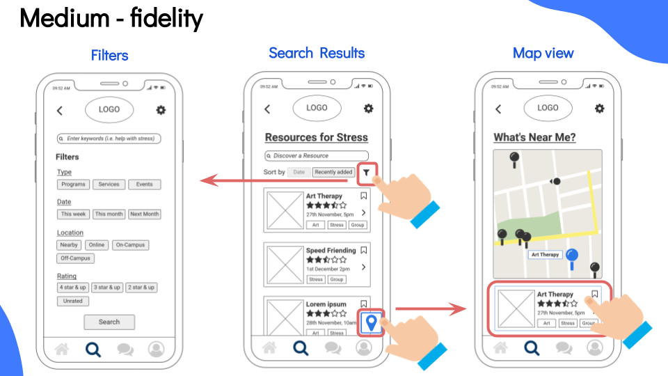
After our lean evaluation, we took this feedback and created our medium-fidelity prototype through the use of Balsamiq, continuing to iterate and align our design towards best practices and user feedback.

The Moment of Truth (Usability Evaluation)
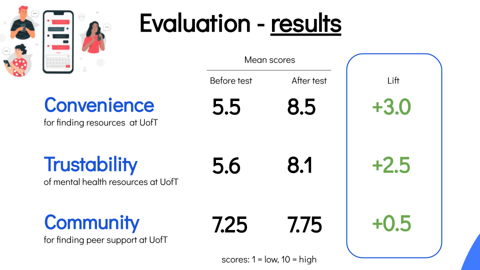
Once our medium-fidelity prototype was refined and polished into a working, clickable prototype, we recruited an additional 4 users from our representative user groups to go through a multi-faceted Usability Evaluation, which included user surveys and moderated usability testing. After collecting the data and feedback, the themes of our key findings included the following:
What worked well
- Flexibility and familiarity of design elements helped users perform tasks
- Easy pathways and simplified flows
- Allowing users more choice and options built convenience and trust
What could be better
- Making it more clear what specific fields apply to users, based on their campus
- Allowing for other engagement options, such as posting pictures
What could be fixed
- Reorganizing the hierarchy and default behaviour of content being presented to align with existing user mental models
- Changing button styles to remove confusion and improve saliency
We also observed an increase in some of the key metrics that we had aimed to evaluate from our four participants – however, this needs to be caveated by the fact we only conducted with a limited number of users, which means the numbers are only suggesting an improvement based on a usability test and not on real-world results. This risk is something that I took particular note of, as my experiences in a real-world design team would benefit from this mindfulness so things aren’t overpromised without actual data.
Outcomes & Next Steps
After 8 weeks, our final deliverable was presenting our case, process, and solution to this existing issue and deliver a full medium-fidelity prototype app with usability testing results, which would act as our executive pitch to a panel of design experts including mental health advocates. Our result was a strong positive reaction and feedback from the panel, which praised our thoughtfulness and boldness to tackle an extremely complex and sensitive issue, along with incorporating an empathetic and relatable story.
Throughout this intensive 8-week journey, I have been fortunate to work with a team that was motivated, diverse, and willing to contribute to design discussions. They have helped broaden my view from my usual process and perspectives, especially as someone who is normally laser-focused on abiding by predetermined standards.

My personal takeaways:
- It’s not always the right approach to stick to a formula – some stories require new ways of storytelling
- Take a step back – I could have taken more steps back throughout the process and reviewed work along with my team
Our next steps as a team would be to continue refining and re-evaluating both our user research and our designs, as we know there are other user groups we weren’t able to cover due to the limited timing and scope. However, this project helped not only highlight our team’s ability to collaborate and design under pressure, but champion issues that would otherwise continue to go unheard. As for my personal next steps, I would be interested in learning more about expanding my ways of approaching problem-solving and mentoring younger designers on design process, risks and considerations, and always referring back to the user. From this project, I feel more confident in being able to uncover unique issues and bring both designers and users through a journey to discover useful and exciting ways to solve them.

